

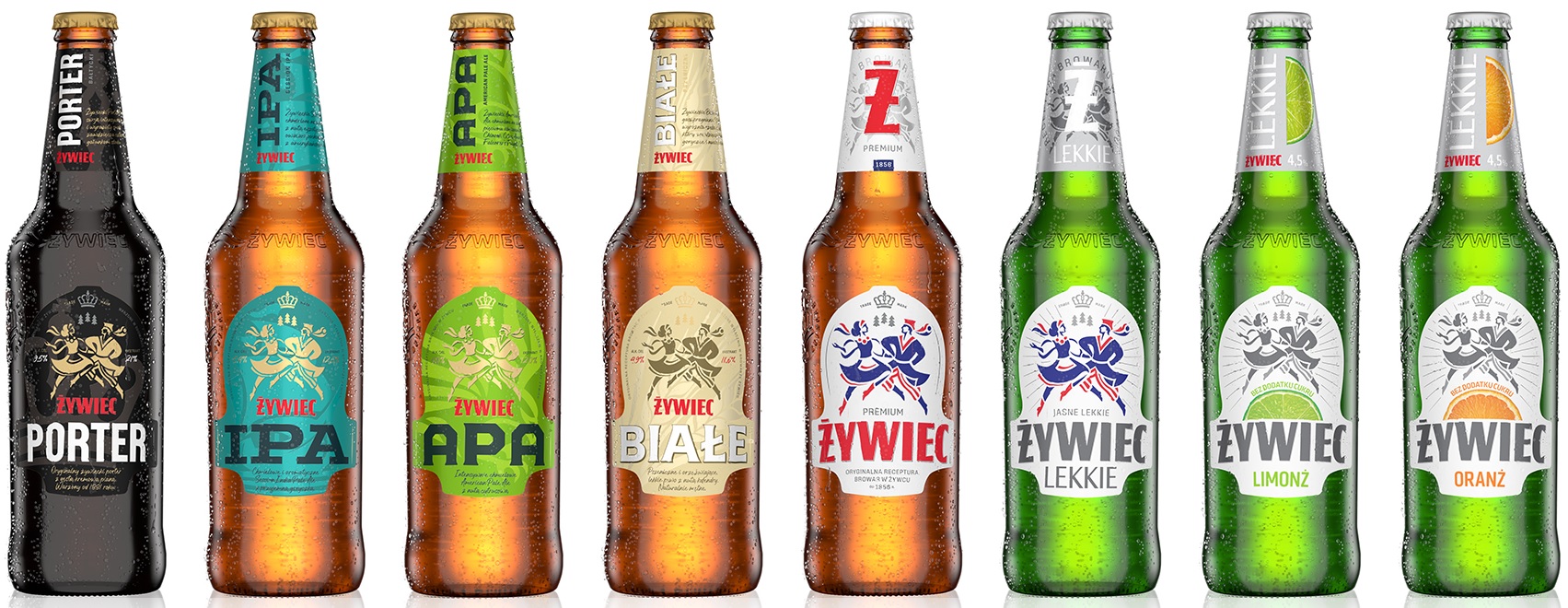
The Żywiec beer brand (produced by Grupa Żywiec) has a changing visual identity, based on a sketch with a dancing couple in Kraków folk costumes.
The Żywiec Group confirmed in the statement that In the new definition, the dancing figures are more dynamic, and the traditional features of Krakow costume are revealed. They symbolize Żywiec’s brand values, such as vitality and the joy of enjoying life together.
– Żywiec’s updated graphic design is the first of the upcoming changes we’ve prepared for consumers this year. In a competitive market like the Polish one, a premium brand like Żywiec needs a unique and consistent visual identity that reflects its personality in order to effectively differentiate itself from other beer brands – describes Monika Staszak, Senior Brand Manager at Grupa Żywiec.
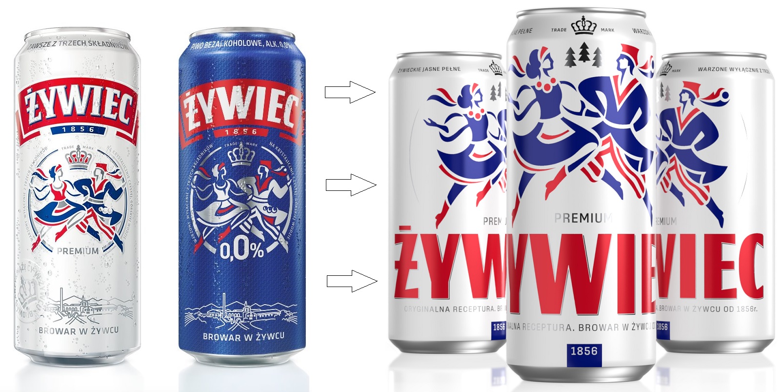
On the new labels of bottles and cans, the Żywiec brand logo is located below, and not above, as before, the graphics with a dancing couple. It is written in a much larger font and without the effect of text curvature. The previous identification, with minor changes, was in effect as of 2013, introduced along with the new brand logo.
The rebranding is part of the “essential” trend.
– This is a long overdue change, because almost 10 years have passed since the previous rebranding – notes Marcin Jurczak, Brand Consultant at BNA. In his opinion, rebranding fits well with the “essentialism” trend – we can see the scaling of the logo and icon along with the reduction of less important elements in the construction of the label.
– This treatment, as well as details such as the revealing tie in reference to the trademark claim and two different hats with ‘dancing couple’ details, should be evaluated favourably. However, some doubts have been raised by the method of coherent marking symbols of the entire Żywiec family. We can guess the motives behind this change, but some variants, such as Żywiec Lekkie, seem to have gained consistency, but lost in distinctiveness. Our interlocutor’s comments.
According to Marek Jones, an independent consultant and brand consultant The new labels for ywiec bottles are much cleaner in shape, making them more visible.
An opportunity to attract young consumers
– The combination of this simplicity and consistent packaging should improve the visibility of Żywiec’s products on the shelf. Attention is also drawn to the new “Ż” branded banner, which is often used in communication. It is good for the brand to think about changing the labels to paper labels, because integrating them with all the other movements will modernize them and attract younger consumers to them, says Marek Jonsieur.
It also mentions Redesigns have a huge impact on sales, which is why serious players usually do a lot of research before bringing new packaging to market.
– I suppose that’s the case here too, although the new graphics of the cans might raise doubts. There’s no denying that cans arranged on visualization can be admired, but rThe reality created by advertising agencies is sometimes different from the reality of the market. After all, no one will put products on the shelf specifically to form the word “Żywiec”, they will only create a mess of syllables incomprehensible to the consumer. The problem with this enclosure is that there is no one, all-encompassing front. On the other hand, the Żywiec brand has surprised us many times with its creative communication, so perhaps something is happening now that would justify the case graphics, which I don’t quite understand – our interlocutor confirms.
In turn, Dr. Jacek Kotarbiński, a marketing expert, claims that adjusting the visual identification will not contribute to the differentiation of the Żywiec beer brand on the shelf. He believes that the change in Żywiec’s identity is to modernize it and to strengthen message dynamics.
– After all, the main motif is a dancing couple in folk costumes. This logo appeared on the label in 1954. which refers to the pre-war tradition of using Polish folklore in trademarks. The brand could not afford revolutionary changes in this area. Elements of Żywiec’s identity have been visible on store shelves for years, which is why it’s more of a subtle change than a revolutionary one. Perhaps the brand in its communication strategy wants to pay more attention to the lifestyle itself, and not to the product. Red beads appear on the women’s outfit, which is an interesting measure. In Krakow, red beads are a symbol of power and wealth. It was often worn by the aristocracy and the wealthy, as well as artists and intellectuals representing the city’s culture and heritage. On the other hand, in highland culture, red corals have different meanings depending on the region. The expert notes that sometimes they symbolize love, happiness and fertility, and sometimes they refer to beliefs and traditions.
It should be noted here that just a few days ago, Tyskie, a competitive brand of Żywiec, produced by Kompania Piwowarska, also in refreshing cans and bottles, was launched on the market.
.jpg)

Echo Richards embodies a personality that is a delightful contradiction: a humble musicaholic who never brags about her expansive knowledge of both classic and contemporary tunes. Infuriatingly modest, one would never know from a mere conversation how deeply entrenched she is in the world of music. This passion seamlessly translates into her problem-solving skills, with Echo often drawing inspiration from melodies and rhythms. A voracious reader, she dives deep into literature, using stories to influence her own hardcore writing. Her spirited advocacy for alcohol isn’t about mere indulgence, but about celebrating life’s poignant moments.


